Digital Art
Microsoft · Product Design
A hyper-realistic digital painting application built for the touch-first era of Windows 8.
The Challenge: Disappearing Into the Canvas
The goal was deceptively simple: bring the tactile joy of physical painting to a digital screen. The technology was remarkable — real-time simulation of bristle behavior, paint viscosity, and pigment blending. But world-class simulation technology creates a world-class design problem. The better the painting experience, the more the interface has to disappear.
The harder question was: disappear for whom? Our users ranged from professional artists with strong mental models and high tolerance for complexity, to children who had never used a stylus, couldn't read menus, and would abandon the experience the moment it felt confusing or punishing.
Designing for that range shaped everything.
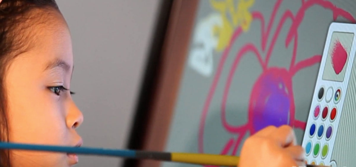
Research: Watching Children Figure It Out
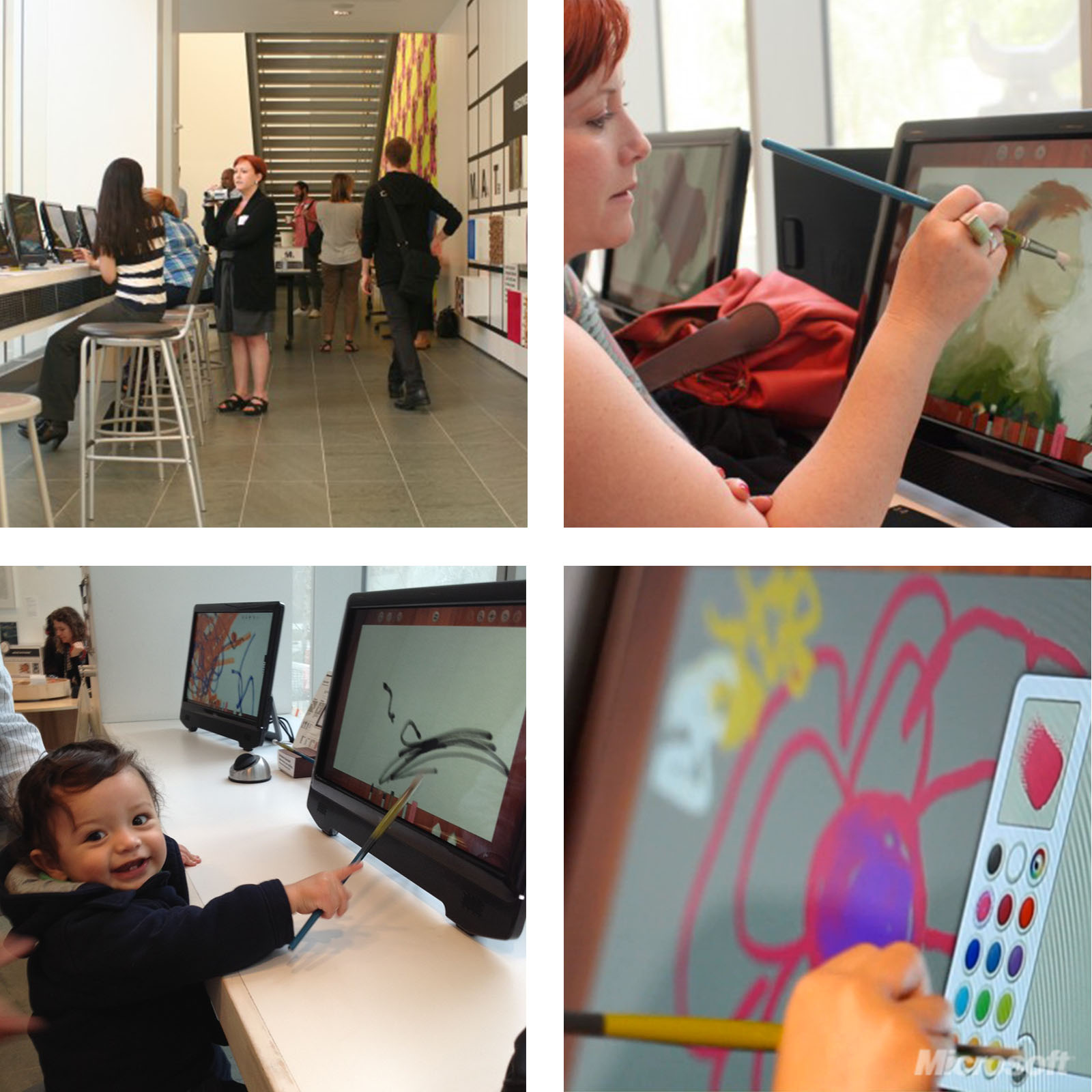
We brought in two distinct user groups: professional artists and children. Observing them side by side was the most clarifying research I've done in my career.
Professional artists explored. They read labels, tried menus, built mental models deliberately. Children did something different — they looked for things they already recognized.
The skeuomorphic UI worked because familiarity is the interface for pre-readers. When a child saw a crayon that looked like a crayon, they picked it up and drew. No instruction needed. When a tool required reading a label or navigating a submenu to discover it, children skipped it entirely — not because they couldn't eventually figure it out, but because the cost of uncertainty wasn't worth it in the moment.
This reframed our design philosophy: for young users, legibility isn't about typography. It's about whether an object's purpose is self-evident before you touch it.
The Unexpected Input Problem
Children are less precious with screens than adults. They put their whole hand down. They stabilize with their palm while drawing with the stylus. In testing, this created an unintended interaction: palm contact while drawing triggered pinch-to-zoom, causing the canvas to jump unpredictably mid-stroke.
For adult users, an accidental zoom is a recoverable annoyance. For a child, it's a signal that they did something wrong — and that the system can't be trusted.
We'd seen this dynamic before: when technology behaves unexpectedly, young users don't debug. They shut down.
The fix wasn't to improve gesture detection. It was to remove the gesture entirely. We replaced pinch-to-zoom with an explicit zoom control — a deliberate UI element that required intentional use. Narrowing the surface area for accidental failure was more valuable than preserving the elegance of a gesture.
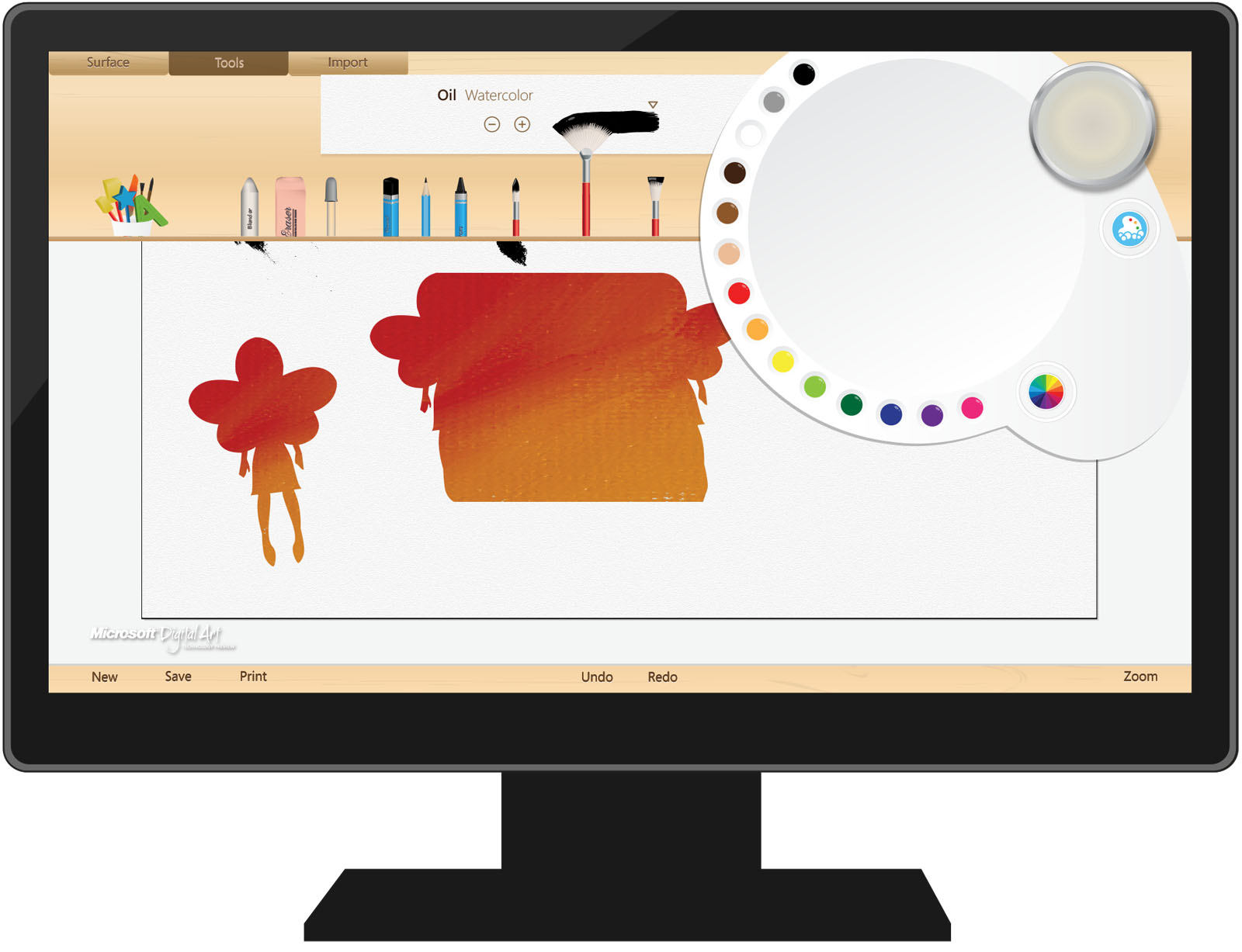
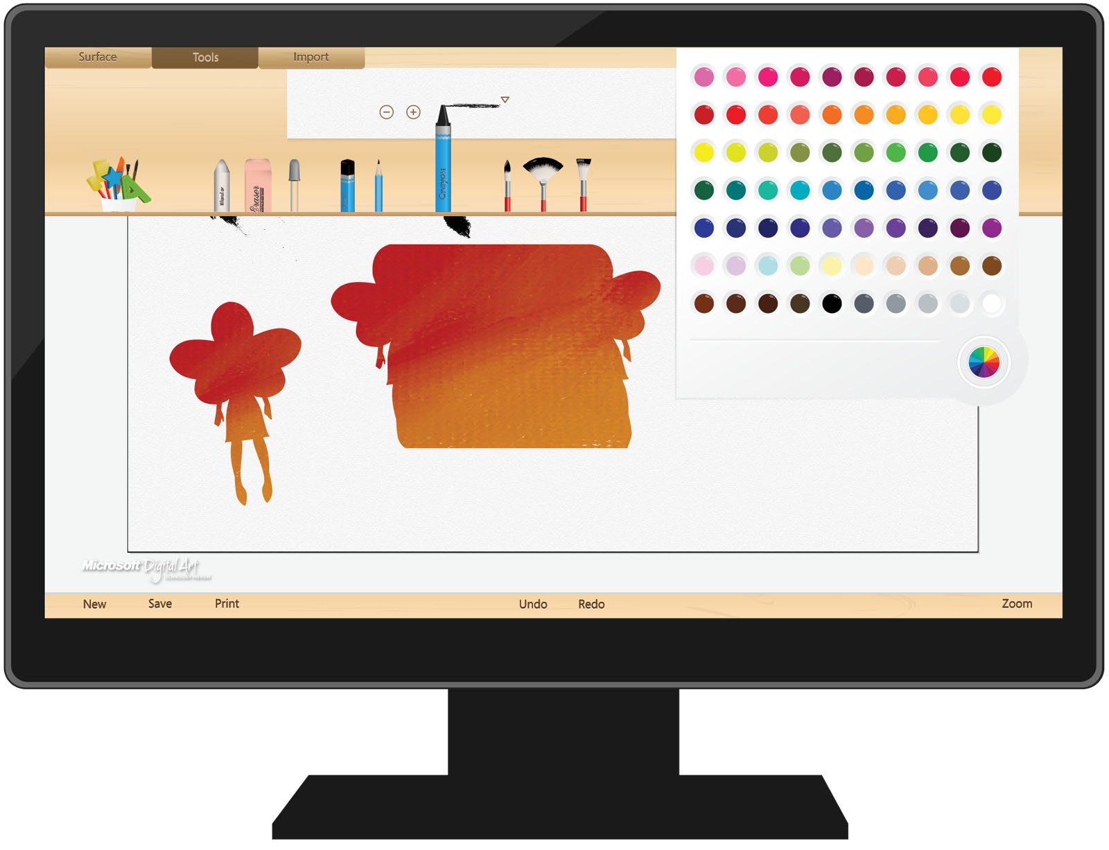
Progressive Disclosure Under Pressure
The menu system presented a different challenge: how do you keep the painting surface clean and uncluttered while still making tools accessible when needed?
Standard progressive disclosure logic says: hide the menus until they're needed, then surface them on demand. That logic holds for adults. For children, it introduced a new failure mode — menus that appeared unexpectedly felt like interruptions or mistakes. Children would freeze, unsure if they'd done something wrong.
Getting the timing and trigger right required calibrating to a different threshold. The menus needed to feel invited, not imposed. Small distinction in language, significant difference in implementation and feel.
Outcome
The final product shipped with a minimal, gesture-driven interface that kept primary tools front and center, reduced gesture surface area to avoid unintended input, and surfaced secondary controls only on explicit invitation. It was selected to be featured at the Museum of Modern Art (MoMA) in New York, where visitors — children and adults alike — used it to create digital works for several months.
Reflection: What Children Taught Me About Interface Trust
The professional artists in our research could recover from confusion. They had enough mental model, patience, and experience to debug an unexpected interaction and move on.
Children can't, and mostly won't. For a young user, a single moment where the system behaves unexpectedly — where they feel trapped, or like they caused a mistake — can end the session. Not just that session. It can color their relationship with the tool, and sometimes with technology more broadly, for a long time afterward.
That's a high bar. It demands interfaces that are self-evident before the first touch, forgiving of unintended input, and that never make the user feel like the problem.
It's the standard I bring to every product since.