Labs
A collection of high-fidelity sketches and technical deep-dives. Less about the perfect spec, more about the feel of the interaction.
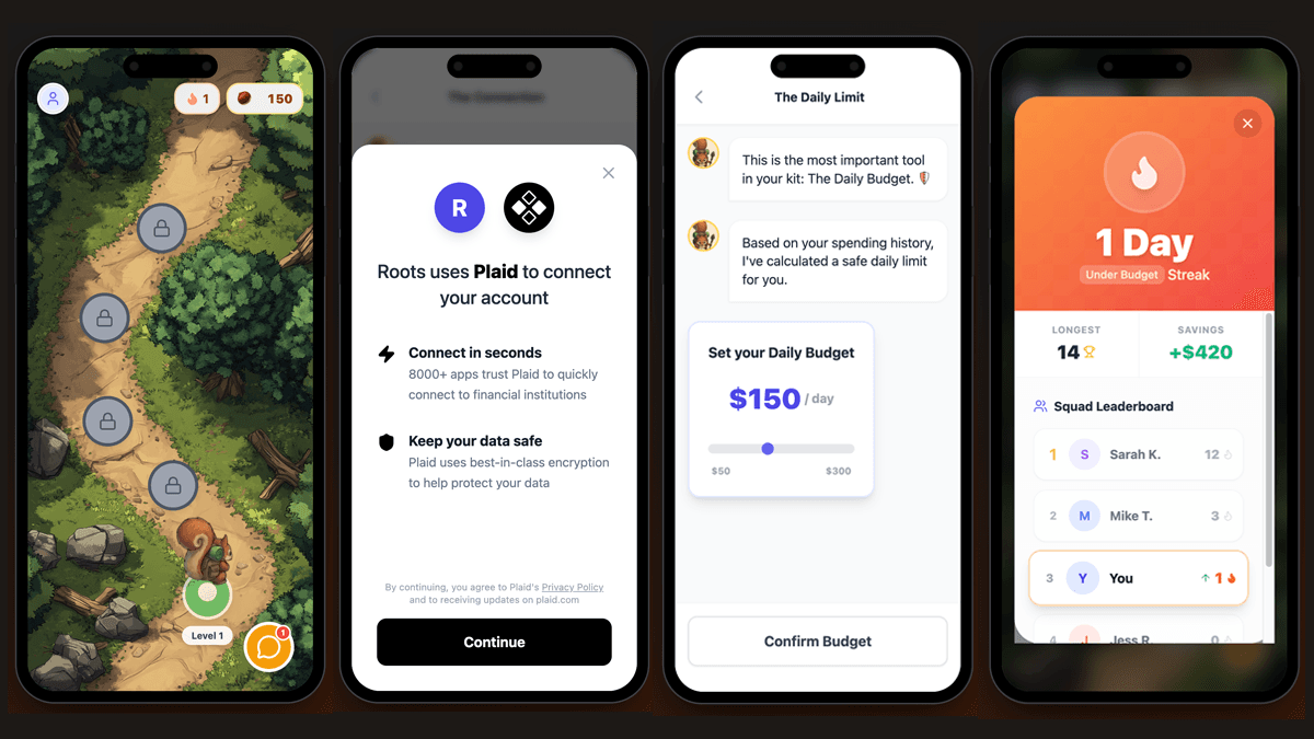
Roots: Gamified Wealth Management
Roots is an interactive personal finance app that transforms wealth building into a delightful learning adventure. Guide your companion, Rooty the Squirrel, through a winding quest toward financial literacy and healthy budgeting habits.

ABS Challenge Visualizer
MLB's new ABS challenge system puts real pitch-location data behind every disputed call — so I pulled the Statcast feed and built an explorer around it. Each challenge is plotted at its exact strike zone coordinates, sized by a live leverage score that factors in inning, score, and runners on base.

Project Spark: Educator App
A functional prototype exploring a friction-free observation workflow for preschool educators. The app lets teachers instantly log student progress and utilizes the Gemini API to automatically draft personalized enrichment activities and "Spark" notes for parents. To evaluate the impact of visual cognitive load on usability, I implemented a real-time toggle between a calm "Purposeful Minimalism" design system and a "High-Contrast Brutalist" UI.
Real-Time Aviation Telemetry HUD
A deep dive into the 514 Labs ecosystem, designed to test the 'Data-to-UI' pipeline from ingestion to deployment. I began by initializing a Moose-based sample application, moving from local environment setup to customizing the data models to capture and process live military aircraft telemetry via ADS-B streams. Orchestrated a local stack of ClickHouse for storage and React for the frontend, eventually bridging the gap to a production-grade deployment on the Boréal hosting service.

Natural Language ECharts
I hooked Claude 3.5 Haiku to "design" charts via chat. It acts as a specialized JSON generator that understands the ECharts schema. By giving it the current state of the chart, the model can precisely target and update nested visual styles based on simple prompts. No more manual config editing—just describing what you want and watching the chart update.

The Multi-Engine Toggle
This is a "switchboard" for data visualization. I built a specialized layer that takes one data source and feeds it into three different charting engines simultaneously. It’s been a lifesaver for comparing how different libraries handle things like hover states and animations, allowing for instant A/B testing of the actual rendering performance.
CoffeeBloom High-Res Extraction
I wanted to see exactly what’s happening inside the basket, so I built a way to visualize the DE1’s high-res pressure and flow data to spot hidden channeling. To keep the playback feeling buttery smooth at 60fps, I’m using a hybrid approach: Canvas handles the heavy lifting for the 10Hz data curves, while SVG keeps the interactive overlays crisp and responsive.