CoffeeBloom
Personal · iOS Engineering
Data Visualization for the Daily Ritual
The Challenge: The Spreadsheet Effect
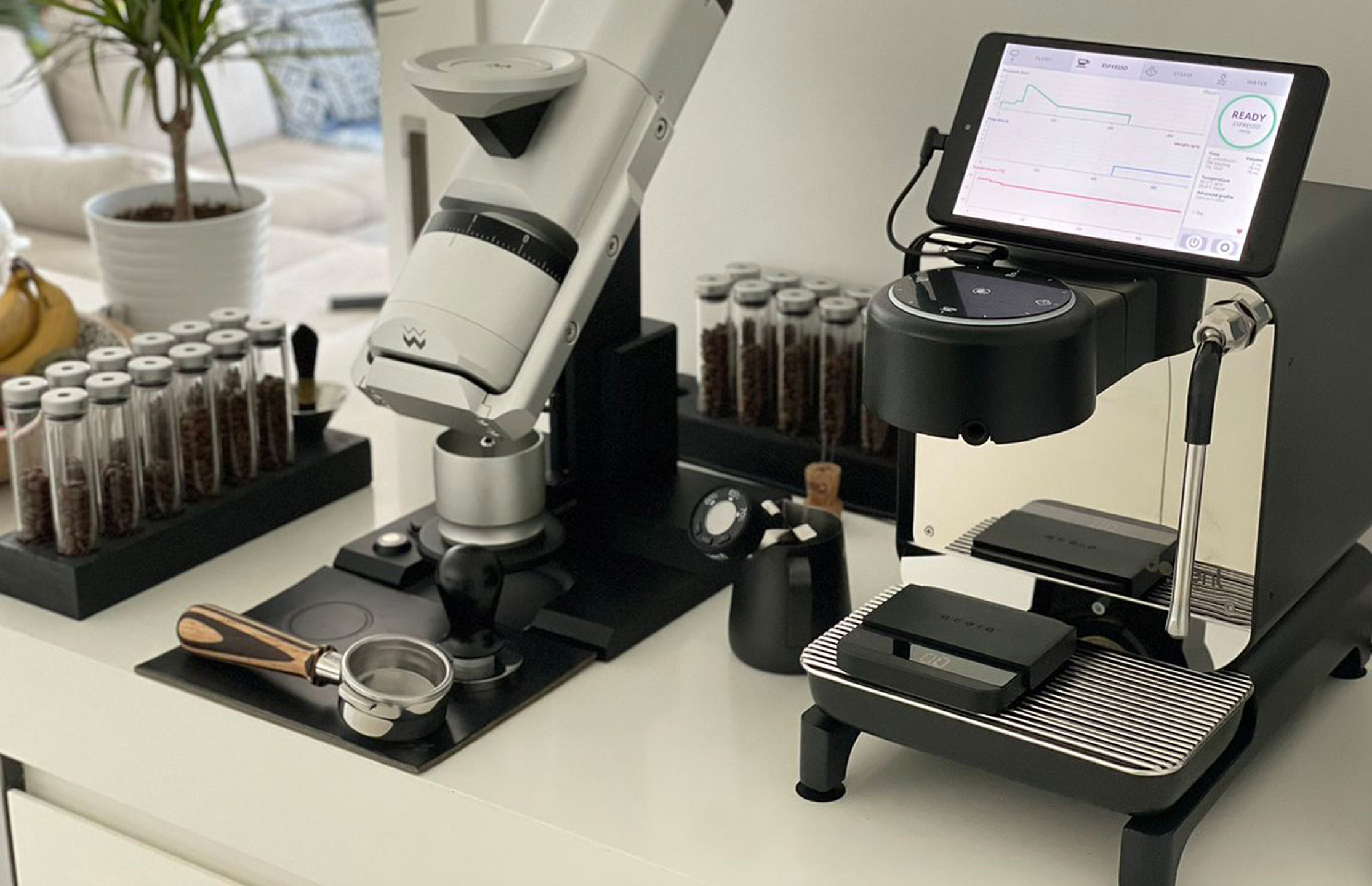
The Decent Espresso ecosystem produces incredible amounts of data, but it often suffers from a "clinical" presentation. Users are forced to interpret complex hydrodynamics from raw line graphs, which creates a disconnect from the ritual of brewing. My goal was to build a tool where the data felt as organic as the coffee itself.
The Solution
I designed a three-tiered experience that moves the user from emotional art to technical clarity.
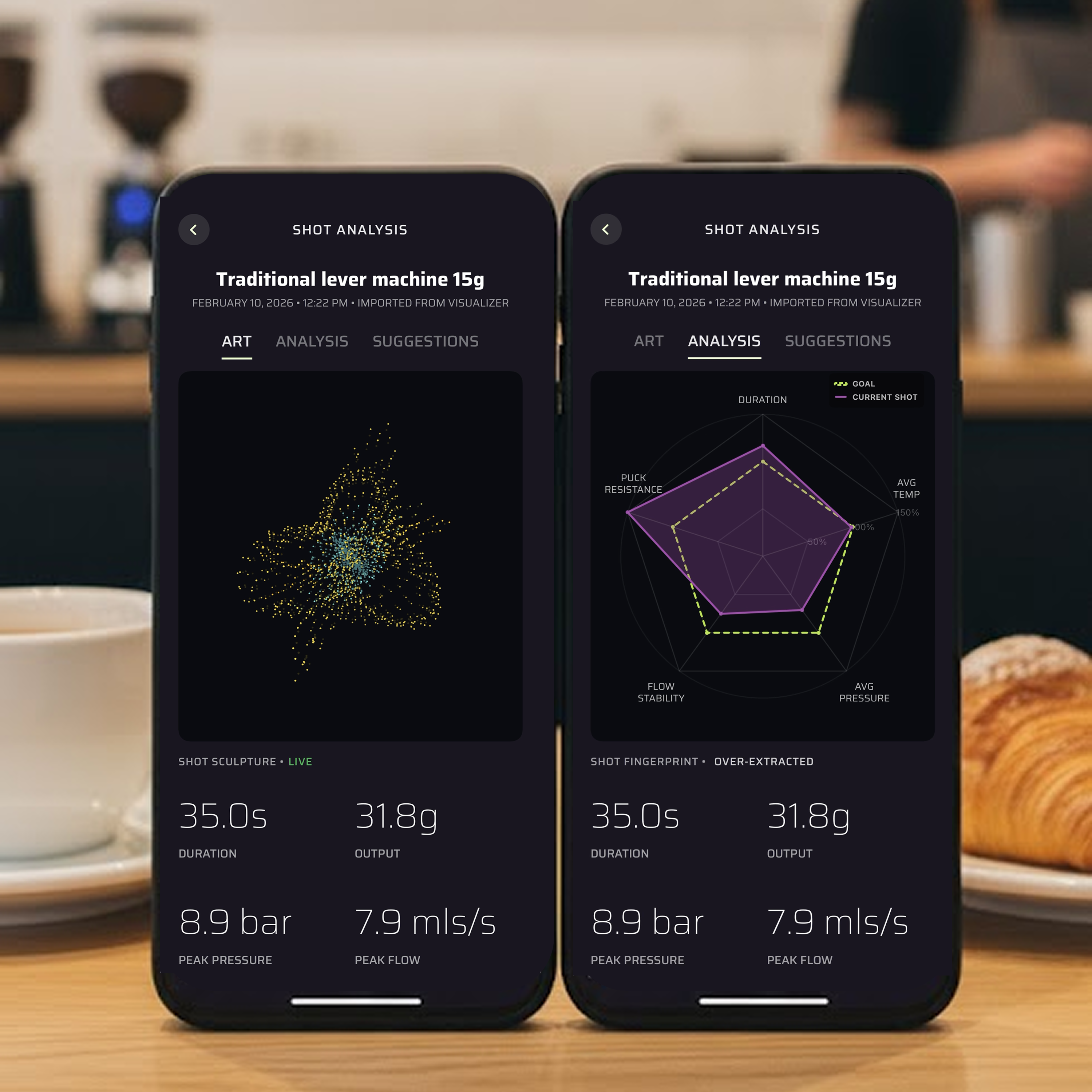
- Generative Art: A volumetric particle system where the radius is driven by pressure and the color gradient reflects thermal stability.
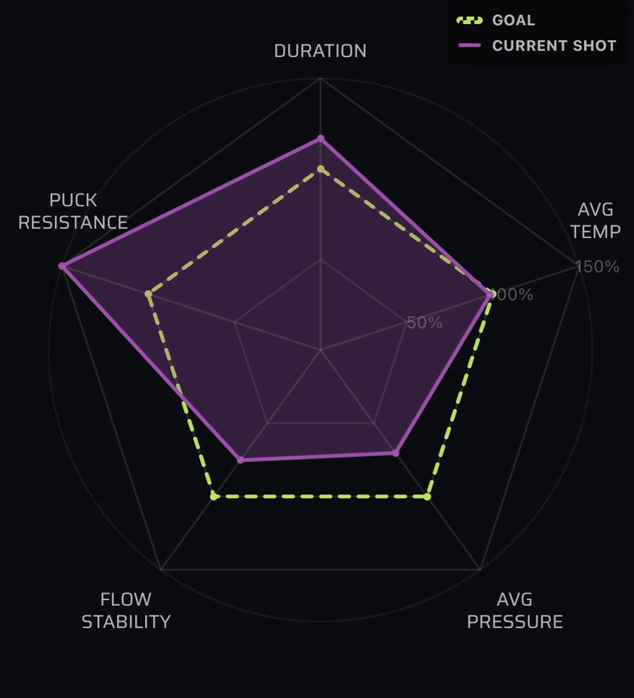
- The 5-Axis Fingerprint: A custom radar chart that distills the "Physics of Extraction" into five digestible metrics.
- Barista AI: A diagnostic engine that identifies complex flaws, such as "channeling" or "choking," which are often missed by simple averages.
Technical Spotlight
Unit Intelligence & Normalization
Real-world data is messy. I implemented a self-correcting parser that automatically detects and normalizes units. For example, if the average temperature exceeds 130, the app recognizes the data as Fahrenheit and converts it to Celsius on the fly to prevent "flatlining" the visualization.
The Inverse Normalization Curve
Mapping "Flow Stability" was a unique UI challenge: in espresso, lower deviation is better. I developed a custom algorithm to reward stability with higher scores on the radar chart, ensuring that a "perfect" 0.0 deviation reflects a high-performing score.
The Result
CoffeeBloom democratizes espresso data. By integrating directly with the Visualizer.coffee API and supporting local .shot files, the app provides a centralized home for a barista's history. It successfully turns a clinical data point into a digital keepsake.